Next Project >

Using User Data to Optimize a Top-Funnel Landing Page

I was on a team of CRO experts helping businesses across multiple industries increase engagement and revenue on their websites. I worked with clients, project managers, and developers to create A/B test plans, interactive prototypes and funnel analyses to increase conversions and revenue per visitor.

At Conversion Fanatics I worked on over 40 websites spanning e-commerce, affiliate marketing, and software-as-a-service. I assisted in monitoring A/B tests and collecting both quantitative and qualitative user data in Google Analytics and CRO platforms like Convert Experiences and VWO.

MY ROLE

Site Analysis
User Research
Wireframing
CRO Consulting
Visual Design
Prototyping
Interaction Design

PLATFORMS

Responsive Web

YEAR

2018‑2019

PROCESS FLOW

CRO and UX are complementary disciplines. Both require analysis, user research, design, and validation. In CRO the goal is to guide users to take a specific action and optimize the experience for the business as well as the user. Because user response is integral to increasing conversions, I touch every step of the process for my clients so that I understand the big picture and can make proper recommendations. The following is an overview of my process:

ANALYSIS RESEARCH IDEATION CREATION VALIDATION ITERATION 01 02 03 04 05 06

Analysis

I work with a project manager to perform the initial site and business analysis. We conduct client calls and perform a cursory user-journey to identify points of friction and opportunities.

Research

Using a combination of Google Analytics data, site heatmaps, feedback polls and site recordings we generate basic personas to guide our future tests. We also identify areas with the greatest falloff to focus our attention.

Ideation

The project manager and I create a test plan that addresses pain points for our audiences. Due to the nature of testing, we keep individual improvements small and self-contained but ensure they add up to address the big-picture.

Creation

I create wireframes, mockups, and interactive prototypes to communicate recommended changes to clients. I then work with the developer to ensure designs are properly translated and QA’d before testing.

Validation

Most designs are run against the control as A/B tests. We use a hypothesis statements to guide what metrics to track in a CRO suite. We then run the test to collect quantitative data and repeat polls, heatmaps and recordings on the new design for qualitative data.

Iteration

Armed with new data, we go back through the ideation phase and determine if we want to iterate. Whether a test wins or loses, we usually learn something new about the site’s audience and aim to improve upon our results.

Problem

A client who sells premium, high-priced furniture is not getting a large sale volume despite having a decent amount of qualified traffic. They are having the most success with lower-priced items, but cannot lower prices in order to make sales due to production and delivery costs. They would like to learn more about user motivations and increase the sales on items in the higher price range.

Research

We began our user journey where we tried to discover points of friction from the perspective of a user. This meant gathering some initial data:

Qualitative Methods

Heatmaps, Recordings, Client-call

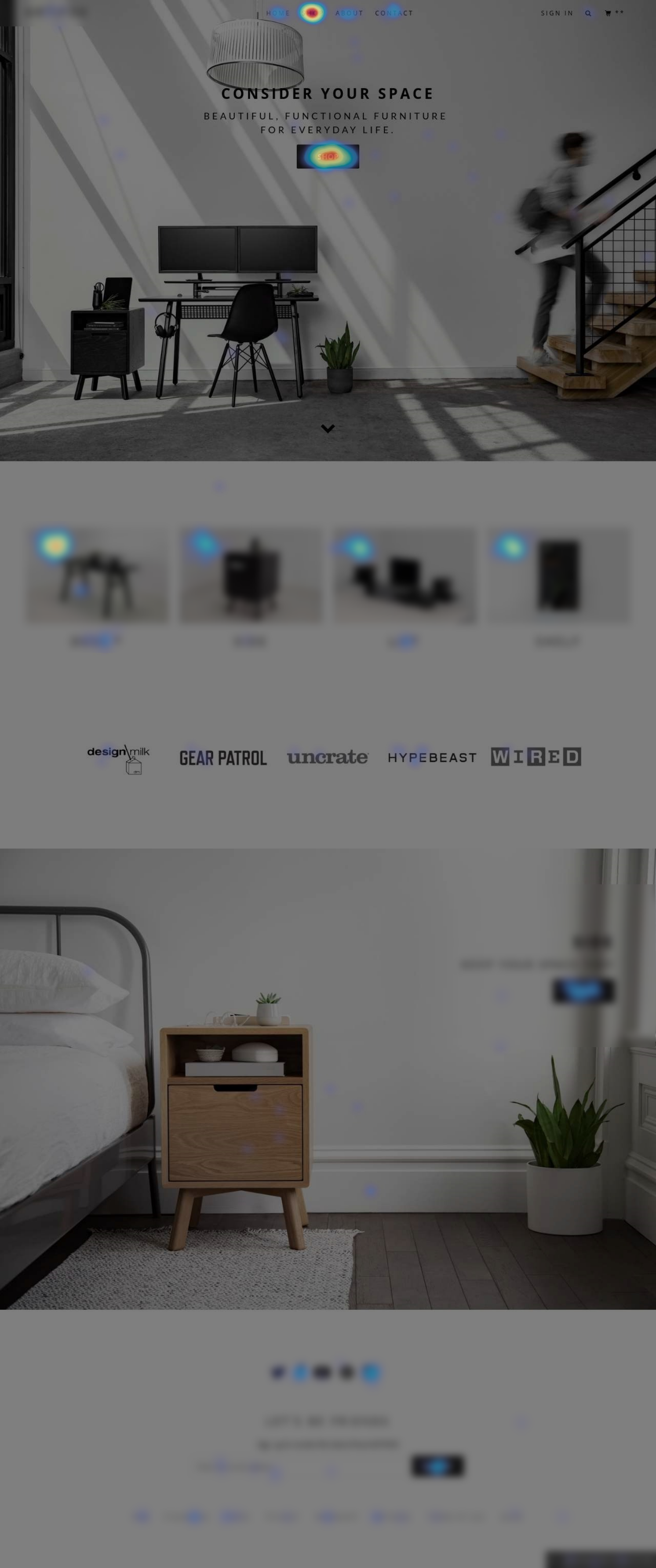
- Heatmaps revealed that users are not scrolling much on the homepage or product pages.

- About half the homepage visitors do not scroll below the full-screen hero and instead navigate immediately to the collections page.

- The products below the hero that lead directly to product pages are getting decent clicks, but only by users who scroll.

Quantitative Methods

Google Analytics, A/A test results

- GA showed us that despite product pages receiving the most qualified, paid traffic, the homepage was still the highest-converting landing page.

- The most popular product was a $100 shelf that was receiving little direct or paid traffic.

- Ads that were bringing users to the site were focused on the desk with a price in the $1000 to $1500 range, and directed to the desk's product page.


Key Observations

Homepage

  • The homepage used a lifestyle image with no real value propositions or demo of the product itself.
  • The image also had multiple focal points including the desk, a lighting fixture, and a model.
  • The only CTA in the page would bring users to the collections page with multiple products.
  • Only users who scrolled lower would see links directly to product pages, but again with no more context other than simple product names.

Product pages

  • Users were not scrolling and many were leaving the page immediately on the desk and other high-priced items.
  • Users stayed longer on the shelf and other less-expensive items that were being purchased more often.
  • Some products had some fantastic video content buried below the fold where users were not seeing it. These videos showed off the items and their unique value in an engaging way.

From the observations we made in the research phase, we surmised that many users were not getting immediate access to engaging information about the product offerings. Since users were not likely to scroll on either the homepage or product pages, many users were missing key info before being shown a premium price tag.

Click Scroll
A heatmap of the click data and scroll data (toggled with the links above)

Ideation

To account for the user behavior we observed in the research phase, I began looking for ways to optimize the area above the fold on the homepage. This meant the hero image would need to be our primary focus. The key changes for the hypothesis were as follows:

  1. Reduce the vertical height of the hero to bring more product thumbnails above the fold.
  2. Select a new image that had a single focal point featuring a product.
  3. Include a call-to-action that would play one of the videos that shows off the product.
Title Title Title Title Title Title Product Image Product Image Fold Fold HEADLINE HEADLINE LOREM IPSUM DOLOR SIT AMET, CONSETETUR SADIPSCING ELITR, SED LOREM IPSUM DOLOR SIT AMET, CONSETETUR SADIPSCING ELITR, SED COLLECTION CTA COLLECTION CTA VIDEO CTA VIDEO CTA Logo Logo Logo Logo Logo

Design

I presented a few options for the new hero to the client, and built out the following two for approval. There were two directions/psychologies we wanted to explore, but we only had enough traffic to test one at a time.

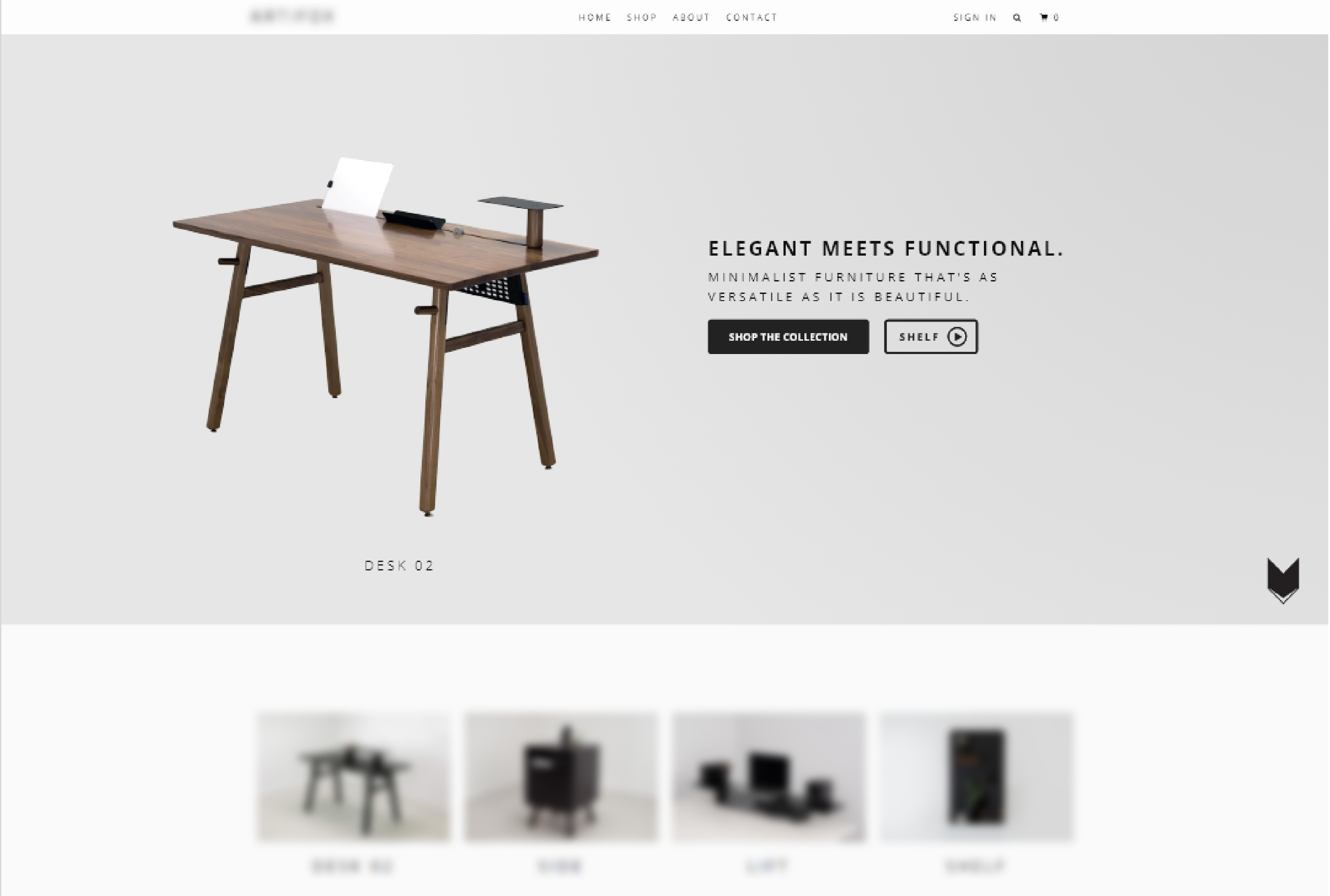
The first hero would be completely product focused. I wanted to explore an image that would show multiple products in a stand-alone light to show off the breadth of the brand. I designed a version that would dynamically rotate between items. In selecting a video, for this one I wanted to show the shelf; the best seller with a conservative price. The idea was to give users an introductory product where they could see benefits and explore more expensive products now armed with the knowledge that the furniture features versatile elements that justified the price tag.

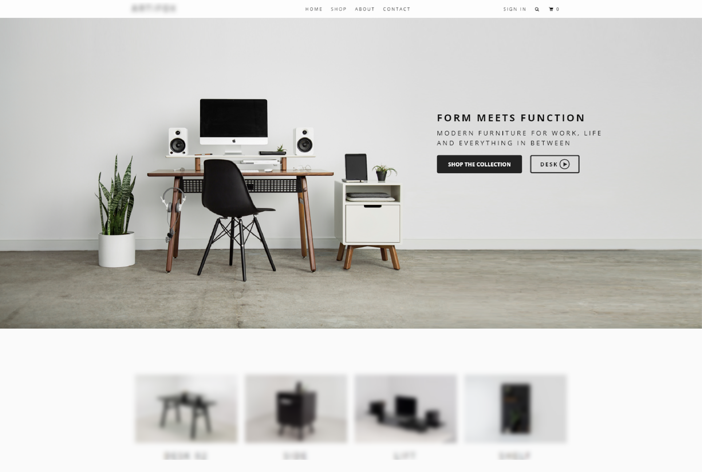
The second option would keep the lifestyle composition of the first image, but with fewer extra focal points. I used photoshop to extend the edges of an image to make it fit in this format. This version would feature the highest priced item in the video in order to encourage more sales of that specific item rather than booting sales of an already decently-selling item.

Mock ups of the suggested hero images. Image contains single item that can rotate different products.

Option 1: Dynamic Products

This hero would rotate between product images to show a broad selection of items. The video would show the popular "shelf" as an introduction to the versatility of the product lines to encourage further exploration of features and value propositions
Mock up of the suggested hero images. Image contains group of products shown together in lifestyle setting.

Option 2: Isolated Lifestyle Image

This option shows a setup of multiple products in more of a "lifestyle" shot. The extra elements from the original are removed and the video features the most premium object with the highest price point.

Development & Testing

Because the client was primarily interested in trying to sell more of the desks, they chose to approve the lifestyle image (option 2) as the first test on the site. Their business goal was to focus on the higher-ticket items, and the desk already had ads ready to go with the desk as a focus.

I finalized the design and used Adobe XD to hand off assets to our team's developer. We worked together to make the layout responsive for all devices with an emphasis on the most common screen resolutions provided by Google Analytics.

We used Convert Experiences to bucket 50% of users who landed on the homepage into seeing our new hero. We tracked metrics across the funnel including product views, add-to-cart actions, purchases, bounce rate, and other metrics. The test ran for two weeks with no edits to traffic allocation or down-funnel experiences.

Results

Out of respect for the client's privacy, I cannot give detailed metrics into specific numbers or revenue, but I can share the lift and loss numbers.
Completed Orders

+44%

Revenue Per Visitor

+128%

Viewed Collections

-6%

Add to Carts

+12%

Graph depicting the change in revenue based on the tests being run.

Since we emphasized a high-ticket item on both devices for this test, the mobile experience suffered, but the overall revenue and conversion rate across all platforms was up. This correlated with our finding that many users made larger purchases on their computers rather then their mobile devices.

Google analytics confirmed that purchases and increased revenue were largely due to a large increase in desk purchases. Since the price was higher, revenue per visitor was increasing drastically faster than the conversion rate. Users also seemed to spend less time bouncing between products and comparison shopping on the site and more quickly made their selections with the new hero, which was reflected in a lower view count on the collections pages and product pages. Users were getting the information they were looking for earlier in the funnel, so those who moved forward were more qualified leads.